
Shipt (Target) – Illustrations

Shipt’s Illustrations
Art Direction
Brand Identity
Illustration
Role
Lead Illustrator & Designer
Year
2019–2022
Delight people to create lasting impressions
The challenge
Illustrations are meant to show the branding in delightful ways that express Shipt’s values. I wanted to incorporate our spirit of “going above and beyond” and convey our thoughtful and reliable service within the app experience.
Solution
I expanded our illustration toolkit to communicate to our shoppers, members, and drivers! I wanted to position our different Shipt avenues as a trustworthy but convenient grocery delivery service, that is reliable, fun, and simple. These illustrations touch the shopper, member, and driver experience through the app, web, social, and email.

Shopper recognition badges
The product team wanted to empower Shoppers to feature their achievements or milestone at Shipt, motivate Shoppers to level up on delivery and service, and enable Members to understand what makes their Shoppers great. I brought those ideas to life by illustrating multiple recognition badges that targeted different values on what makes a Shopper amazing. Shoppers would be able to proudly show these achievements on their profiles.

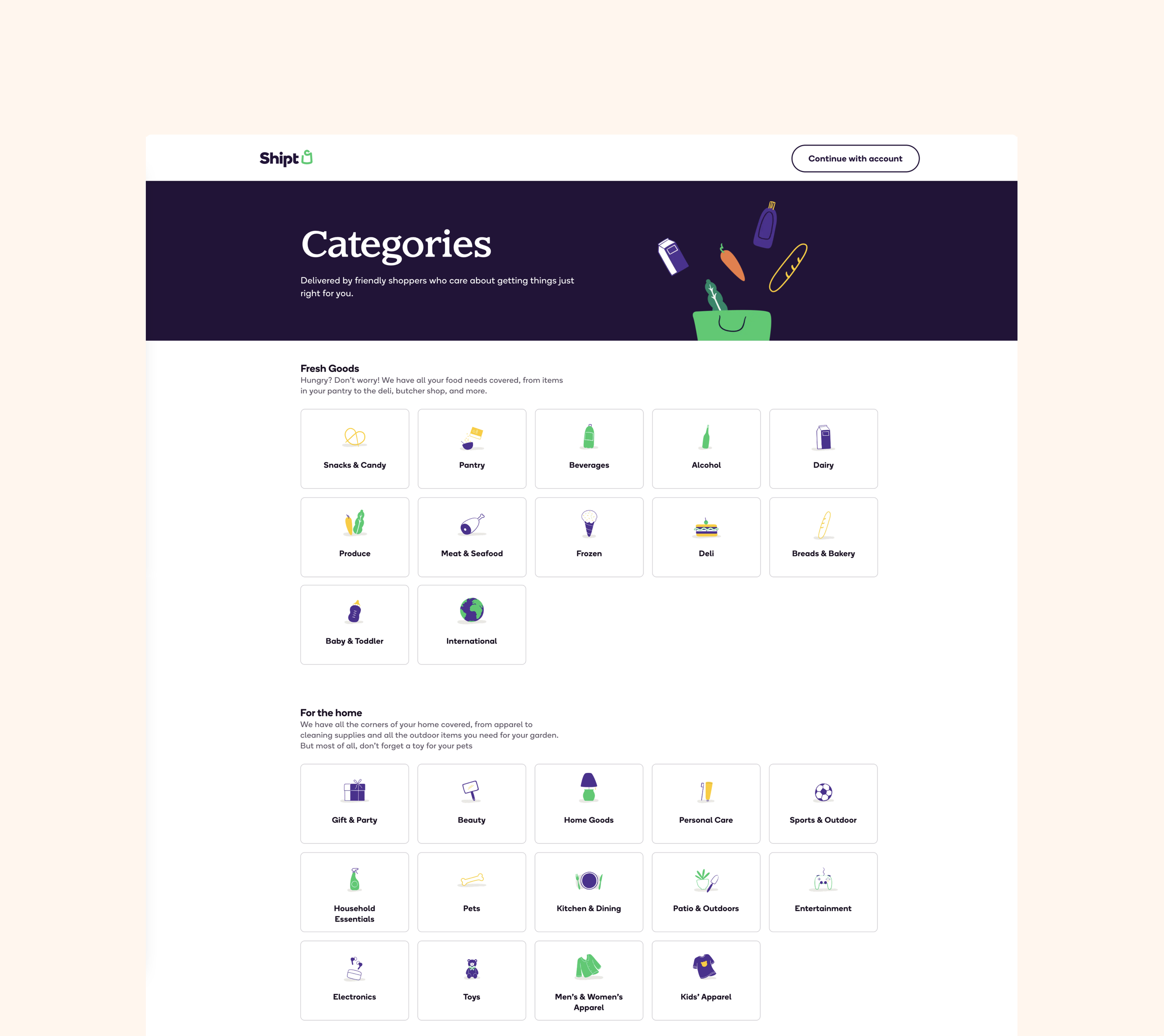
Illustrative category icons
As a member, the first thing you see on the homepage are the top categories icons at the top of the screen. We decided to have them vibrant so they can stand out from one another as it’s easier to choose from the selection from groceries to home decor. I collaborated with the merchandising team to decide on the category illustrations that directly represent the product assortment across retailers. I made careful considerations on which products would best represent each category that not only is recognizable, gender-neutral, but inclusive from a diversity standpoint.
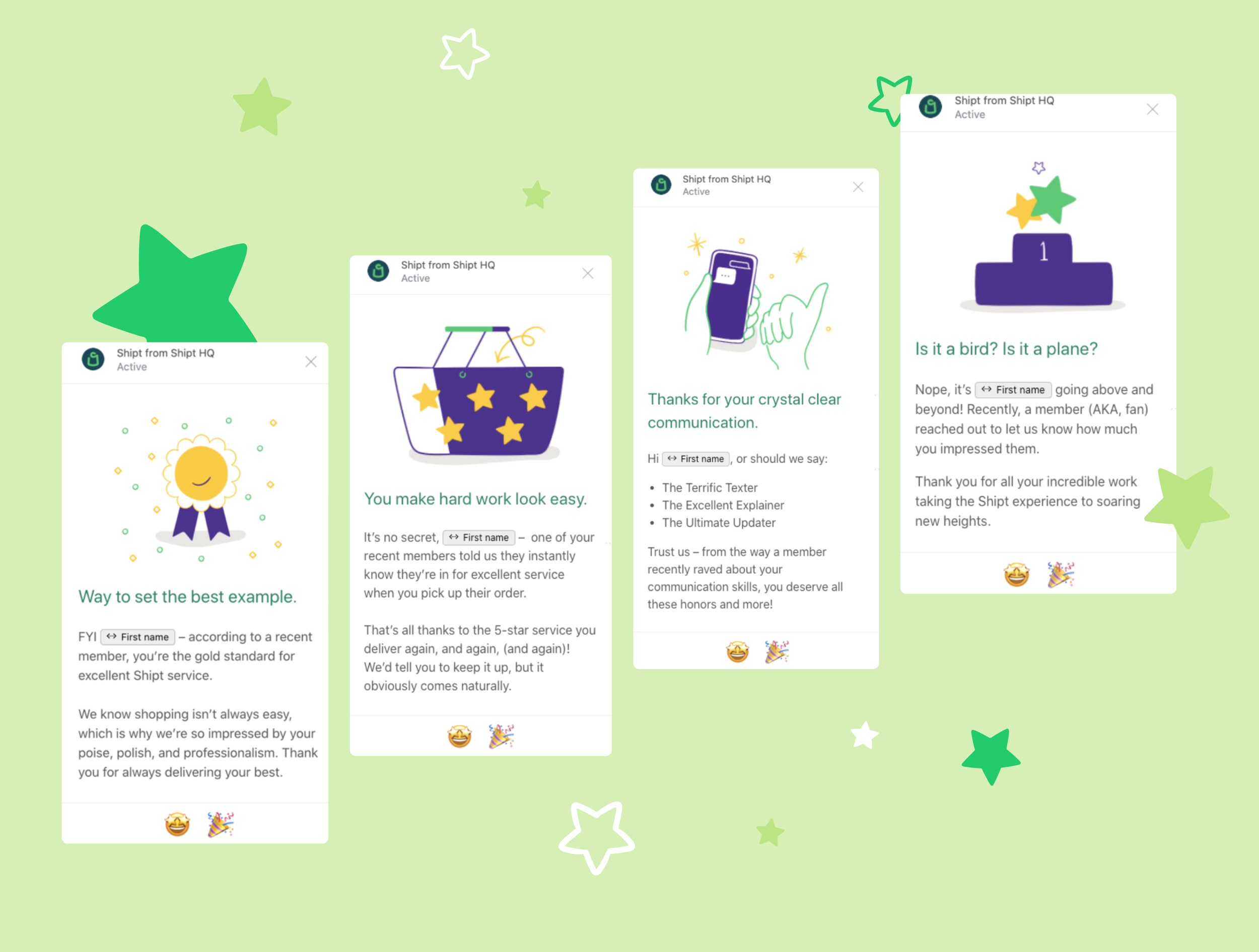
Shopper Kudos
We wanted to revamp our Shopper Appreciation efforts and provide more consistent and specific appreciation. There are 4 overarching categories: Overachieving Achiever, Communication Guru, Consistency is Key, and Poise & Professionalism. The goal was to convey to our shoppers as best as possible what members/HQ/store employees are saying about them to improve morale and keep them motivated!

404 Landing page
We thought it’d be fun to add an easter egg to the 404 error page when something slips up!
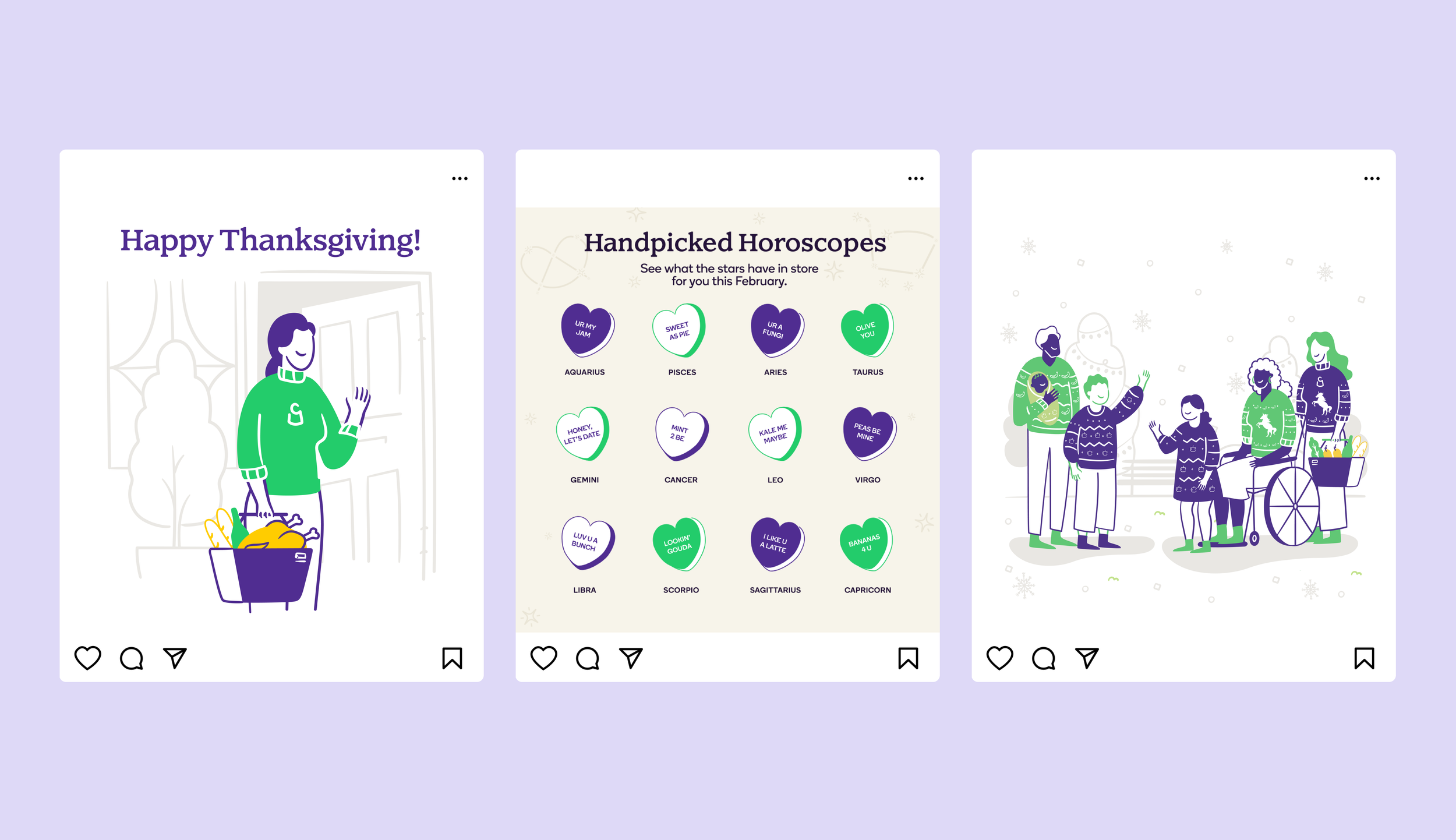
Social
There is an opportunity to use illustrations when we don’t have photography to convey the message, especially when it comes to holidays. During these Covid times, I wanted it to respect social distancing and convey the message of gathering to spend time with your loved ones.
Team
Clarisse Mooney, Art Direction
Nancy Hu, Lead Illustrator & Designer
Rachel Martin, Copy Direction
Shawn Woznicki, Creative Direction
Results
The illustrations have elevated the product by adding delight and some fun! I’m glad to be able to add my own flair of fun yet stay on brand with these illustrations. There is a time and place for communicating in a straightforward manner or being whimsical. I enjoyed the process of creating delight with the collaboration with other teams to bring the experience to life!