
Shipt (Target) – Icon Refresh

Elevating brand through icons
Shipt was on a journey to do an internal refresh of its visual identity. I was the sole and lead designer on this project which consisted of research, exploration, development, pitching, execution, and implementation. I was responsible for creating new scable icon assets and an icon library with guidelines for the team. I partnered with the core team and cross-functional partners to strategize on how these icons can work hard for our partners and elevate our app experience.
The challenge
There’s been a gap between the brand and Product team and I saw this as a great opportunity to close that gap and have more conversations on how we can be better partners. The product team already had a design system in place and the challenge was to build off of that but also the icon set design had to fit under our new art direction style: fresh, bright, and human.
Shipt’s icon refresh
Art Direction
Marketing Collateral
Design System
Role
Lead Designer
Year
2023


Art direction
Our approach to our evergreen illustrations is a flat but textured block print/screen printed (hand-done) approach. Consistency will come through in our deliberately limited color palette and the use of color tints and textures to help define our creative’s dimensionality.
This “printed” approach will be a unique graphic style shared across a bench of illustrators. Since these specific techniques take extensive time, effort, and an artist’s hand to produce it will give our creative a greater sense of quality and the premium touch to our community expects.

Competitive analysis
As I was researching the icon treatment for our competitors, I noticed each icon style was either illustrated or stroke-only icons that spoke to their brand values. I wanted the new refresh to be reminiscent of the humanity aspect and have that shine through with the hand-done texture from the illustrations.

Icon exploration
My explorations started with 2 different approaches, one with a closed gap so it’s more recognizable and one with a contained fill to see how the portholes would look like holding more weight. As I was experimenting with the different variation of texture on the portholes, I was considering the file size of the icon and porthole as a whole.
As a team, we aligned on the second texture of the risograph that pulls from our illustration style. That one felt more easy to identify, as the first texture felt like it was competing with the Icon as the main hierarchy with it’s sharper notes.


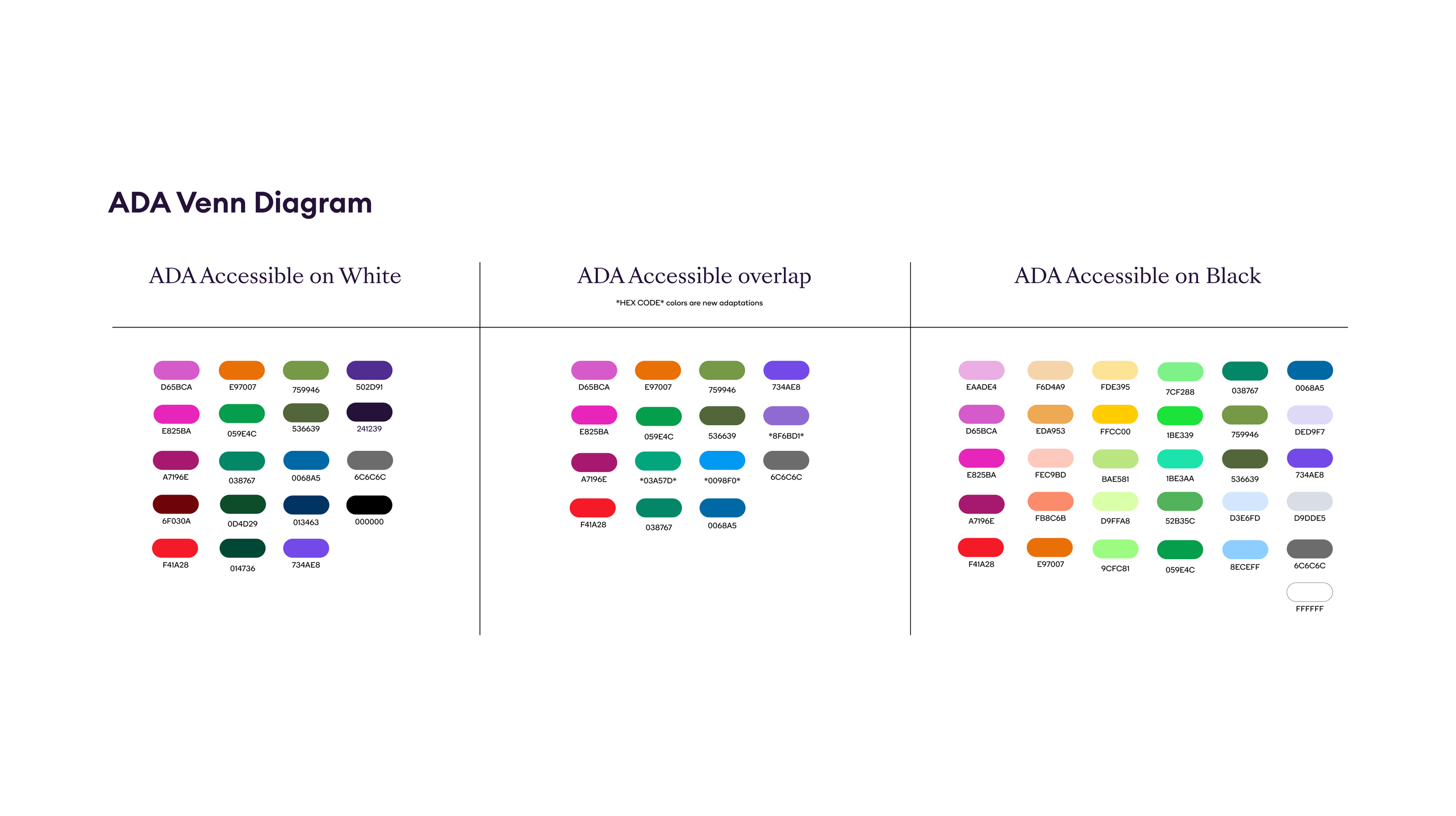
Accessibility
This was the most intensive part of the process but also very fun. I tested every color in our palette with a color contrast checker to see if the graphic was accessible in black and white. Some colors had less contrast and I adjusted to be slightly brighter. This chart is meant to show a glance of the different use cases the color groups fell under and it became the building block of the guidelines.
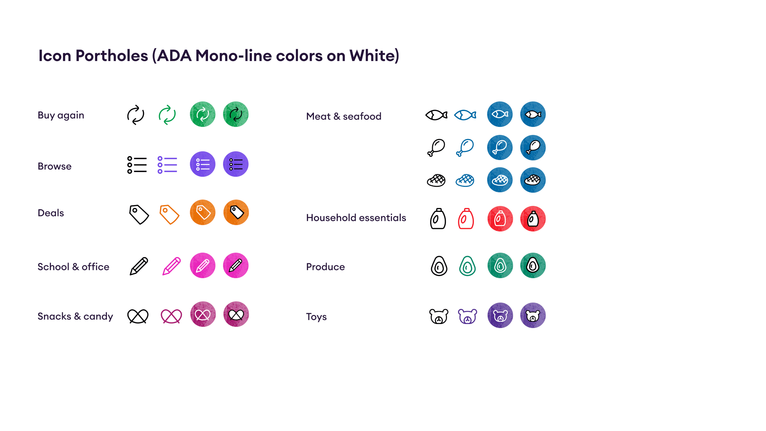
Icon portholes
This was testing our the different ADA-accessible colors and seeing which color sets work well within our platforms like app, collateral, landing pages, and internal decks but also fit into our art direction.
Standardizing icon strokes
We streamlined the icon strokes to a 2-point weight and rounded out the terminals and radiuses to create a friendlier version of the icons. I learned that sometimes consistency means that some outliers break that rule to stay consistent. In this case, I tested out different weights on icons that optically were an outlier.

Color palette applied
I took the new icon stoke style with accessible colors to create a chart that became the building block of the guidelines. I also considered if folks with vision impairment could see the icon portholes and checked in with our product partners that they were likely to see them through a screen reader, which is built into the settings of most smartphones.


Guidelines & documentation
I developed an evolving document of our illustration and icon guidelines so we can create consistency around all deliverables across the board. I built rules that worked within the parameters of our deliverables and around building out illustrations and icons. This document would continue to grow as the design system scales.

Team
Emily Daniello, Project Management
Kristina Kulp, Content Strategy
Madison Bryant, Content Strategy
Michael J. Harris, Creative Direction
Nancy Hu, Lead Designer & Art Director
Patrick Kelleher, Product Director