
Shipt (Target) – Illustration Refresh

Sparking connections and hinting at humanity with a new style
Shipt was on a journey to do an internal refresh of its visual identity. I was tasked to provide art direction for the new illustration style and ensure consistency and brand value in the illustrations. I was responsible for creating new illustration assets and an illustration library with guidelines for the team. I partnered with the core team and cross-functional partners to strategize which illustrations to refresh and collaborated with an external illustrator to bring the vision to life.
The challenge
As a brand team, our goal was to elevate the creative and foster brand love of Shipt. We revamped our internal brand spark to be fresh, human, and bright, we wanted that art direction to reflect our illustrations. Our existing illustrations were speaking a different language and we wanted to convey warmth through tonal colors, sparks of humanity with a risograph texture, and freshness that separated us from our competition.
Shipt’s illustration refresh
Art Direction
Marketing Collateral
Design System
Illustration
Role
Art Director & Designer & Illustrator
Year
2023


Existing Visual System
The existing visual system served us well in the past but didn’t speak to our shifted brand values. A refresh was needed to ensure that it spoke to our core users and cements us as the most trusted delivery brand. These illustrations are used in a number of touchpoints, and they play an important part in our storytelling/communication within the org and externally.

Types of illustration
Audit
It was an opportunity to partner with the Product team to help them meet their goals of creating illustrations that represented sections of the site (categories, empty cart, no results found, buy again, deals, etc), facilitate tutorials and explanations, as well as live on dark mode and light mode page background. We were able to get a full audit of illustrations in the system and strategize what to prioritize based on team roadmaps and bandwidth. It was important for me to think about how illustrations could have more legs and work in different situations within the app experience (evergreen/everyday, retailer-agnostic, seasonal moments, heritage months, and beyond).

Potential styles for Hands, People, Objects, Environments, Pattern illustration pillars – Ruby Taylor (Bottom row, middle)
Art direction
This process was a long one as we wanted to be very intentional about our approach. We explored many styles and ultimately wanted to differentiate from our competitors. Our approach to our evergreen illustrations is a flat but textured block print/screen printed (hand-done) approach. Consistency will come through in our deliberately limited color palette and the use of color tints and textures to help define our creative’s dimensionality. We partnered up with the talented Ruby Taylor to bring our vision to life and to be our first illustrator in this wave. I brainstormed ideas and gave art direction on illustrations with my team relating to story, color, composition, and motion. Ultimately we want to be inclusive of our illustrations like representing all skin tones/hues, hair textures, gender expressions, relationship dynamics, body types, abilities, and ages. We brought along our DEI&B team so they could assess and give their valued input.

New color palette
A refresh of the secondary color palette was necessary as we wanted to expand colors to be used in our illustrations. This process included pulling colors from our new photography style which were bright, saturated and full rainbow. After some testing and mockups. I decided it was more beneficial to have a full range of tones for each color so they blend seamlessly together. It was necessary to expand our green spectrum palette as we were owning green and pull tones that could add some kinetic energy to the palette.

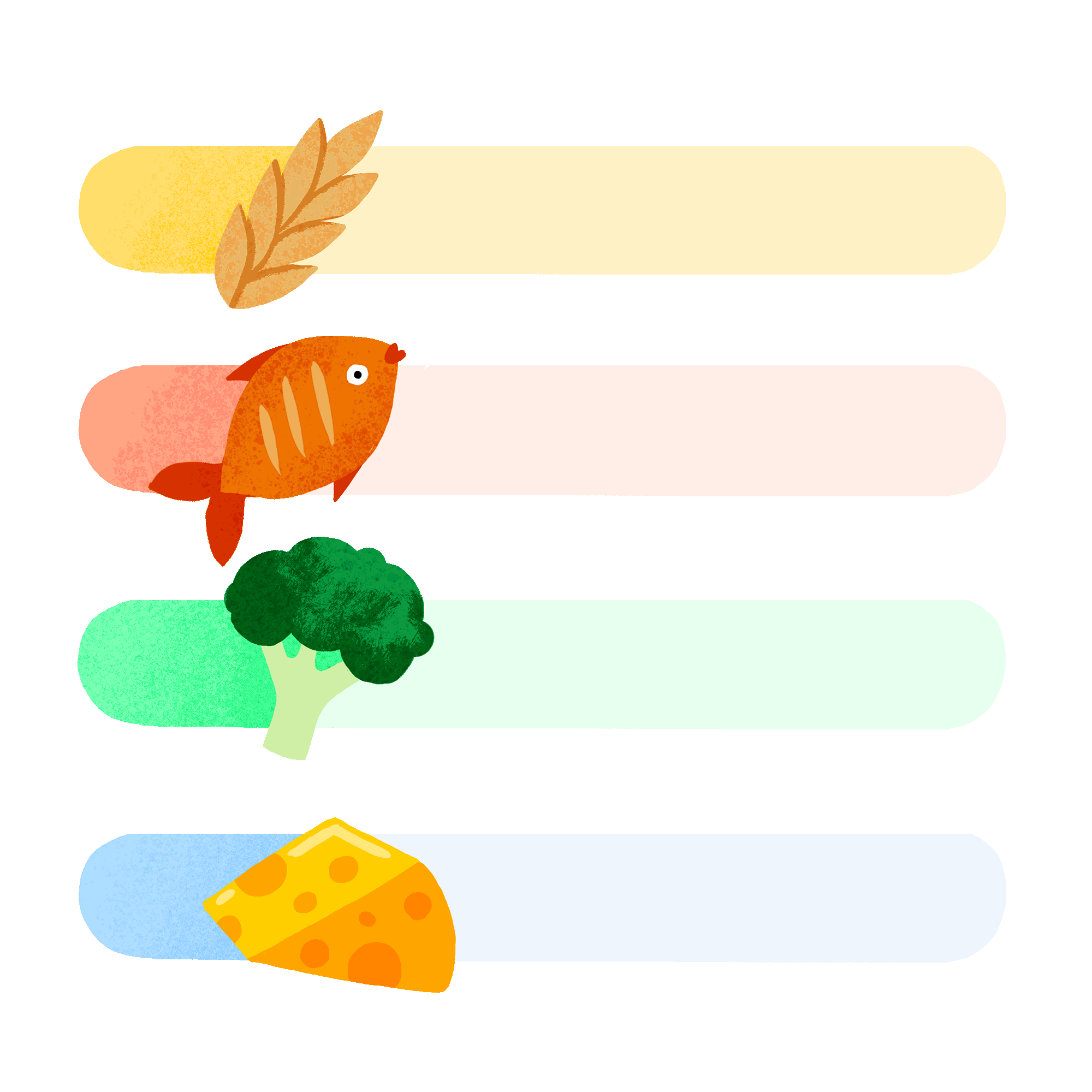
New illustration set (objects)
Complete illustration set
All of our “object” creative will be used as a way to show our “evergreen” value especially for things that don’t photograph well. We included hidden messages that represent our core values, hidden braille, autism sign, ribbons, patterns in the finger print, etc that mean things to various communities.


The results
We have scaled our category shopping (MVP) and ended up seeing over 4% engagement with the category shelf, increases to OV (order volume), ATC (add to cart), and visits to the RHP (retailer homepage). We found that over 20% of folks who engaged with category shopping used the SECONDARY shelf way down on the GHP (global homepage). Over 50% of users who used category shopping selected "grocery" - which is great because this means the new (more granular) categories are truly going to be more useful to people.
Evolving illustration library
The Product team were looking for an illustration tool kit / style guide that they can use like a “set of paper dolls. Since most of the designers on that team are not illustrators by trade, to have a library of vector foundational parts that they can mix and match would help to speed up the building process. I was responsible to create these building blocks and files for clear direction and guidance on how to expand our illustration library that would help maintain a consistent look and feel of the brand.

Holiday illustrations
These additional holiday illustrations are both culturally inclusive and seasonally agnostic. It was important for me to strategize how these could be agnostic and be able to flex into different situations. I provided art directions aligned with my team and presented ideas to our illustrator. They turned out so lovely and brought out our Shipt spark!


Expressions
I gave our old expressions/accent marks a facelift too alongside the illustration revamp. I standardized the width strokes and tested many risograph textures to stay consistent throughout them. I created them on Procreate and then transferred them onto Illustrator to digitize them for our Figma library. These expressions will live on web, print, product, and even photography whenever there is a chance to bring some spark into a headline or photo.
Team
Emily Daniello, Project Manager
Esme McGlasson, Copy Direction
Kristina Kulp, Content Strategy
Madison Bryant, Content Strategy
Michael J. Harris, Creative Direction
Nancy Hu, Lead Designer & Art Director
Patrick Kelleher, Product Director
Ruby Taylor, Freelance Illustrator
Selene Huang, Art Director